Our last post focused on contextualising concept art within its collaborative environment. We looked at an example of a collaborative project that I am currently undertaking alongside a 3D artist, to create a Japanese style frog temple environment. We mainly focused on the central altar, which took the form of a stone frog statue, and this is what we'll be working on again today.
Our discussion is going to be continuing on with the theme of collaborative work, this time moving away from collaboration throughout the design process, and into bridging the gap between concept and production. To this end, we're going to be taking a look at examples of concepts that provide utility and clarity for the production team.
Turnarounds and Callouts
When presenting concepts, we should aim for them to convey as much information as possible, as clearly as possible, so the production team aren't left questioning the details of whatever it is they're making. Two of the most common aspects of concept presentation in industry that help with this are 'turnarounds' and 'callouts', so what are these and how should we use them?
Beginning with turnarounds, they're exactly what they sounds like - a set of drawings of the same concept from multiple angles (quite literally turning the object around). So why are these useful? Well somebody is going to have to model your concept in 3D, and understanding what it looks like from various angles is of course integral to that process.
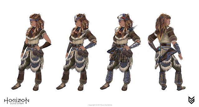 |
| Official costume concepts for Horizon Zero Dawn's Aloy, featuring rear view turnarounds (Guerilla) |
Character concept sheets such as these serve as a good example of the use of turnarounds. It's common for character concepts to provide a front 3/4 view, as well as a back view. These back views are especially important for cases where the character's back involves any prominent design features such as cloaks or bags. This becomes especially important when designing the protagonist of a third person game, as the player will spend the majority of their time viewing the character from this rear angle. Just to be clear, turnarounds aren't purely used for character concepts though; they can also be useful for other concepts such as architectural pieces, for instance.
Onto callouts then. These are extrapolations of a particular element within an overall design, made to provide information and clarity for that specific object/part. If we continue with our character concept example, it would be useful to provide callouts for things like weapons or gadgets/pouches that they carry, alongside the overall concept.
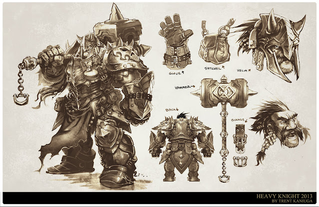
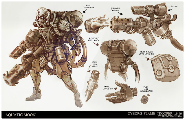
These character concepts by Trent Kaniuga, an artist that has previously worked for studios such as Riot and Blizzard, provide great examples of callouts. As we can see, he provides closeups for all sorts of design features, from weapons, to gloves, buckles and pouches. These callouts, similarly to turnarounds, serve to provide the modeller with more information to work from when creating the in-game asset. Callouts can also be useful for providing animators with more information. For instance in the case of a mechanical weapon that can switch between modes, it would be useful to provide a callout explaining the movement of the mechanism involved, using arrows or any other form of visualisation.
Creating a Production Concept
With this understanding under our belts, let's have a look at the final stages of our current practical demonstration, the frog statue concept. Our first step is to build on our basic design sketch from the previous post, so that we have something that conveys a little more information than just a simple outline. We're going to continue working with the front perspective for this, simply because it's how we've worked until now.
As you can see, I've added colour to give a better indication of form, textures and materials. This is already much more useful to a modeller than our original design sketch, but there's still work to be done.
Our next step is to work on turnarounds for the statue. In this case, Elliot asked for front, side, back and top views, but the requirement will differ depending on the concept and the modeller, sometimes with just two angles needed, as we saw with the Aloy character sheets above.
As you can see I've first used the front perspective to make a side perspective. The main thing I want to touch on here is how incredibly helpful and important it is to use construction lines from your first perspective to build out the others. Not only does it make your life a lot easier, it also allows you to retain much more accurate proportions than you would just by eyeballing it. This is important because a lot of modellers like to place turnarounds like these into their planes when working in 3D, to use as direct reference, so if the turnarounds aren't all accurate in terms of proportions, it'll cause them some trouble.
Now that we have our first turnaround, it's just a question of repeating the process to complete our set of four:
As you can see, we now have our four angles, but there's still a bit left to do before we hand over a finished concept sheet. Notice how the turnarounds don't have the prayer bead necklace on them - this is simply because Elliot wanted to sculpt it as a separate object, and therefore didn't want it showing on the frog turns, so that nothing was covered up. We therefore also need a mockup of the statue with its necklace on, like our original design sketch but with the same level of rendering that's present in the turns. This is also a good opportunity to place the frog on some sort of altar with some candles, as is its intended context. Alongside this mockup, I also need to provide a prayer bead callout to showcase the gold kanji that is written on them, as they are quite small compared to the overall design. Here is the final concept sheet, which includes these two additional features.
From Concept To Realisation
At the stage where I gave the finished sheet over to Elliot, he now had everything he needed to model the statue, so he got to work on it. I think he did an outstanding job on it, and it turned out better than I could have imagined!
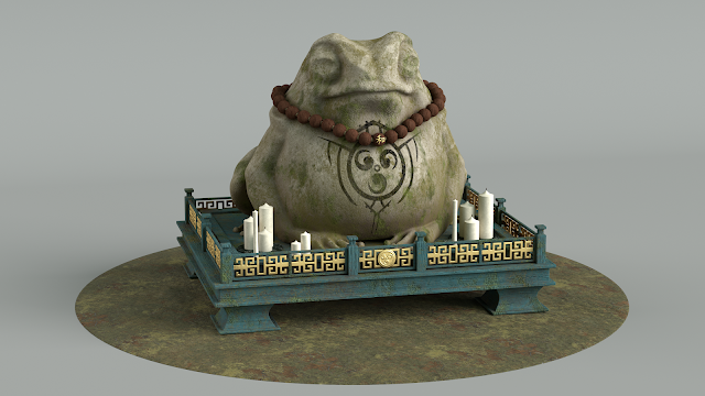 |
| Elliot's final render. Check it out on his portfolio: https://ethreedee.wixsite.com/website/frogstatue |
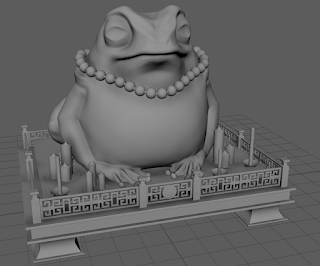 |
| Elliot's 3D Sculpt |
As you can see, there are artistic changes from the concept to the final model, but that's to be expected. Try not to be too precious about your concept art, after all it is only a guideline, and the other members of a creative team will apply their own artistic touches to the final result too. In this case, Elliot reduced the frog's girth just a little bit, as he found that the original dimensions from the concept didn't translate as well to 3D aesthetically. He also removed the kanji from all of the beads but the central one, which is definitely an improvement, and also one that we spoke about beforehand, I should add. Finally, the altar is more or less his own design based on some imagery he found, and that's completely fine - in fact I'd say it's significantly more appealing than the quick mockup I had made, which was only intended to be a placeholder to visualise the frog in its context anyway. What I hope this shows you is that you should be open to the creativity of your other team members rather than being overly protective of your designs, as the end result has a good chance of being improved by the combination of creative inputs.
Summary
Today we looked at the collaborative role of a concept artist from the angle of providing concepts that facilitate ease of production through features such as turnarounds and callouts. We first discussed these techniques and looked at examples of their implementation in the work of industry professionals. We then looked at the process of completing our frog statue concept, as well as the final outcome, modelled by Elliot. With this post, we've now finished our discussion of the collaborative side of a concept artist's role. Technical stuff aside, what I really hope you've taken on board here is the value in hearing what others have to say, and being willing to cooperate with them effectively.
At this point, we've now covered a good range of topics on this platform, from research and design work, to the industry role of a concept artist as part of a production pipeline. In our next post, we'll be capping everything off with a general summary of the things we've learnt over the course of the blog. We're also going to be having a little look back at the last year to see the progress I've made (which I expect to be highly embarrassing on my end), and hopefully show you that you can achieve the same and more, with some application of the ideas we've talked about here.


Comments
Post a Comment